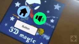
AR Button
An A-Frame component and primitive for creating buttons. Buttons respond to clicks and are used to perform some action. They're customizable and built on top of the ar-clickable component.
Important
AR Buttons require an ar-pointer-tracker in your scene!
Properties
| Property | Description | Default |
|---|---|---|
enabled |
Whether or not the button is enabled. | true |
src |
The graphic of the button. If none is provided, a default graphic is used. | "" |
width |
The width of the button. | 0.5 |
height |
The height of the button. | 0.5 |
color |
The color tint of the button. | "white" |
pressed-color |
The color tint of the button when pressed. | "#ffd855" |
disabled-color |
The color tint of the button when disabled. | "gray" |
Look and feel
Setting the text
You can set a text by attaching the text component to your <ar-button>:
<ar-button
    width="0.75" height="0.25"
    text="value: Button; align: center; color: black; wrapCount: 15"
></ar-button>
Refer to the documentation of the text component for more details.
Changing the colors
Changing the colors is simple to do:
Customizing the graphic
You can also customize the graphic of your <ar-button> by changing its src property. You'll typically set it to a query selector that refers to an image:
<ar-button id="my-button" src="#my-button-image"></ar-button>

<!-- ... -->

<a-assets>
  <img id="my-button-image" src="assets/my-button-image.png">
</a-assets>
Tip: changing the graphic when pressed
If you also want to change the graphic of the button when it's being pressed, set its pressed-color to white and employ ar-onmousedown and ar-onmouseup as follows:
Detecting clicks
Using ar-onclick
AR Buttons are built on top of AR Clickables and respond to the same events. In particular, the "click" event should be listened to in order to initiate an action. The ar-onclick component makes that really easy:
<!-- Change the graphic of the button when it's clicked -->
<ar-button src="#image-1" ar-onclick="ar-button.src: #image-2"></ar-button>
Button clicks can also affect other entities:
<!-- Make the sphere visible when clicking the button -->
<ar-button ar-onclick="_target: #sphere; visible: true"></ar-button>
<a-sphere id="sphere" position="1 0 0" visible="false"></a-sphere>
Refer to the documentation of ar-clickable for details on ar-onclick.
Using JavaScript
While ar-onclick is easy-to-use, it's limited to setting properties. For advanced usage, you need JavaScript. Write a component and listen to the "click" event as in the template below:
/*
  Usage:
  <ar-button do-something-on-click></ar-button>
*/
AFRAME.registerComponent('do-something-on-click', {

    dependencies: [ 'ar-button' ],

    init()
    {
        this._onclick = this._onclick.bind(this);
    },

    play()
    {
        this.el.addEventListener('click', this._onclick);
    },

    pause()
    {
        this.el.removeEventListener('click', this._onclick);
    },

    _onclick()
    {
        console.log('Do something! ;)');
    },

});